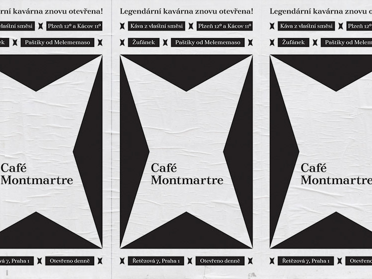
Typeface Design: Faun

Project: Typeface design – Faun Italic, Faun Black Italic
Master Thesis at Ladislav Sutnar Faculty of Design and Art, University of West Bohemia
Supervisor: Doc. Kristina Fišerová
Co-author: Prof. Rostislav Vaněk
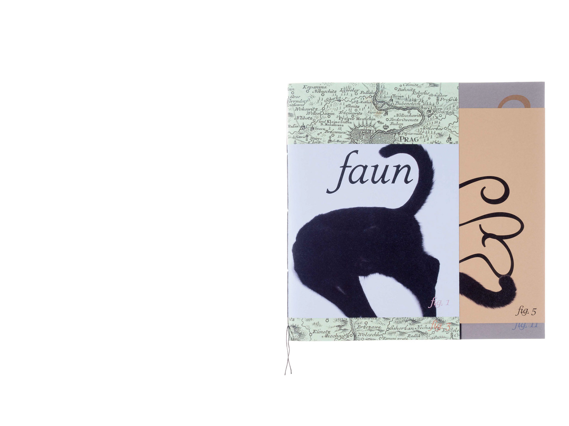


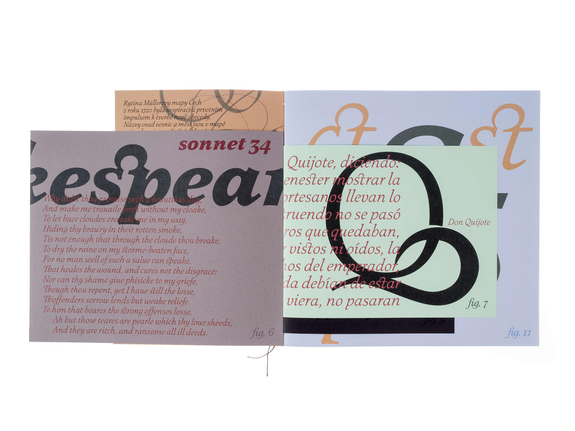

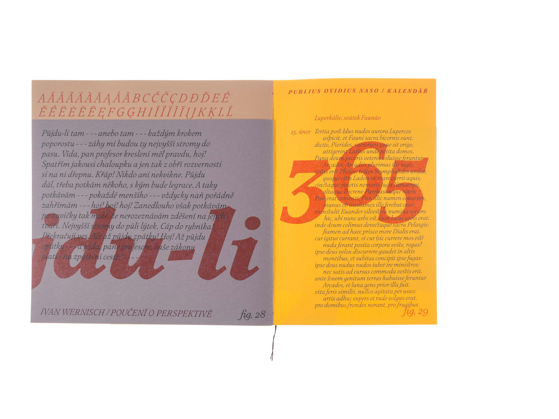
The engraving of Muller’s map of Bohemia from the year 1720 was the first source of inspiration and the first impulse to start creating this new typeface. The names of little towns and villages on this map are engraved in italics excerpting writings of that period. A similarity in lettering can be found with authors such as Philipp Grandjean (1702), J. M. Fleischmann (1732) and many others.
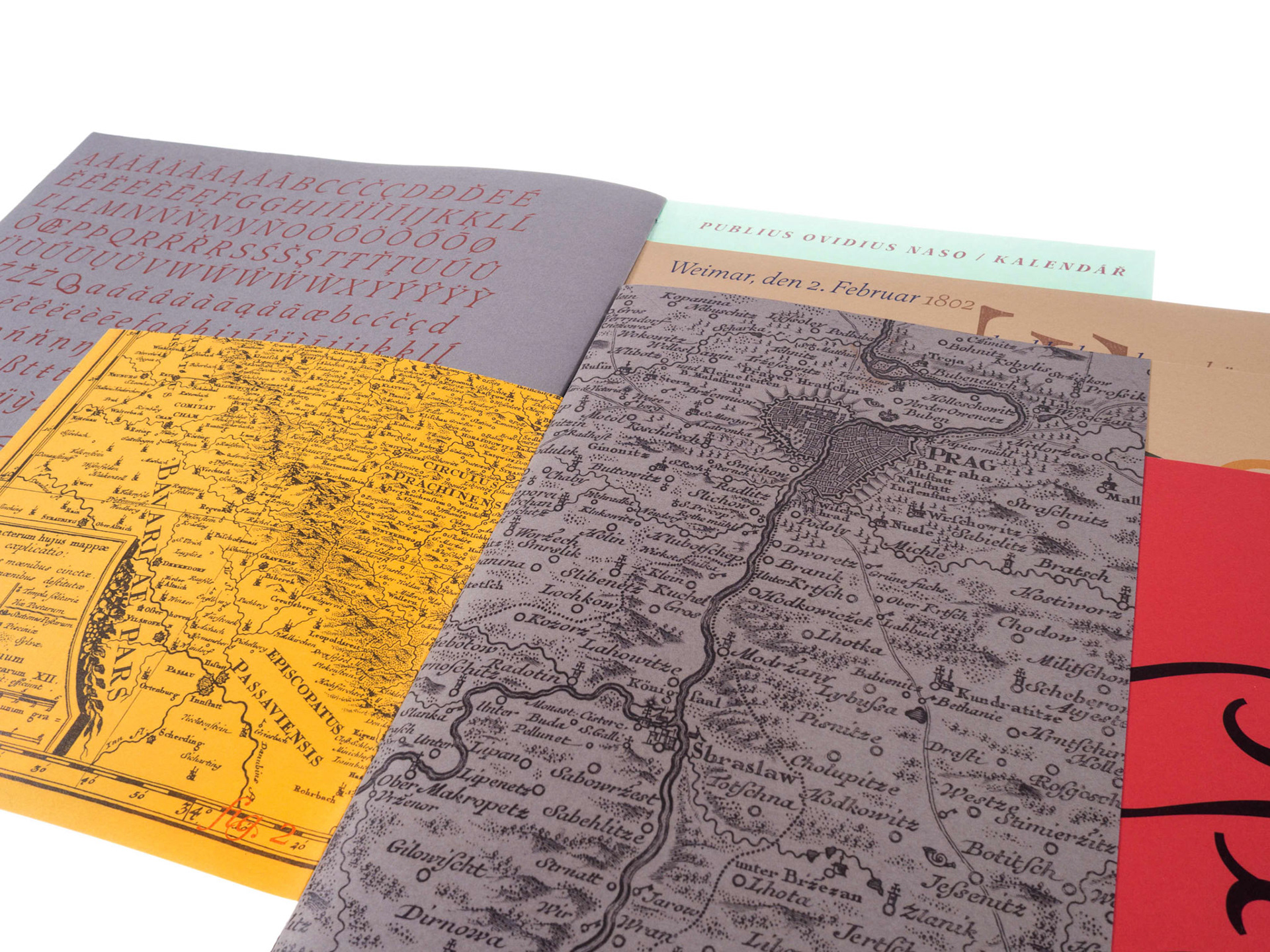
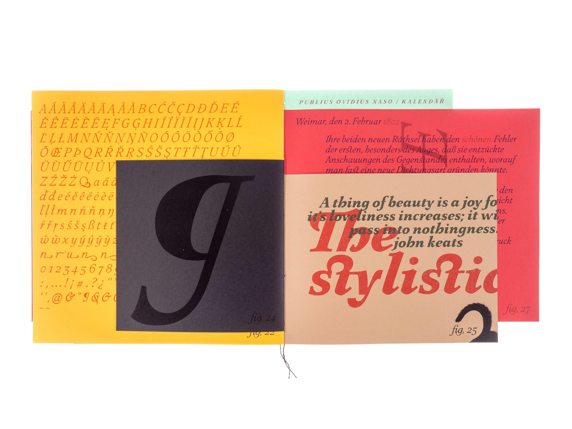
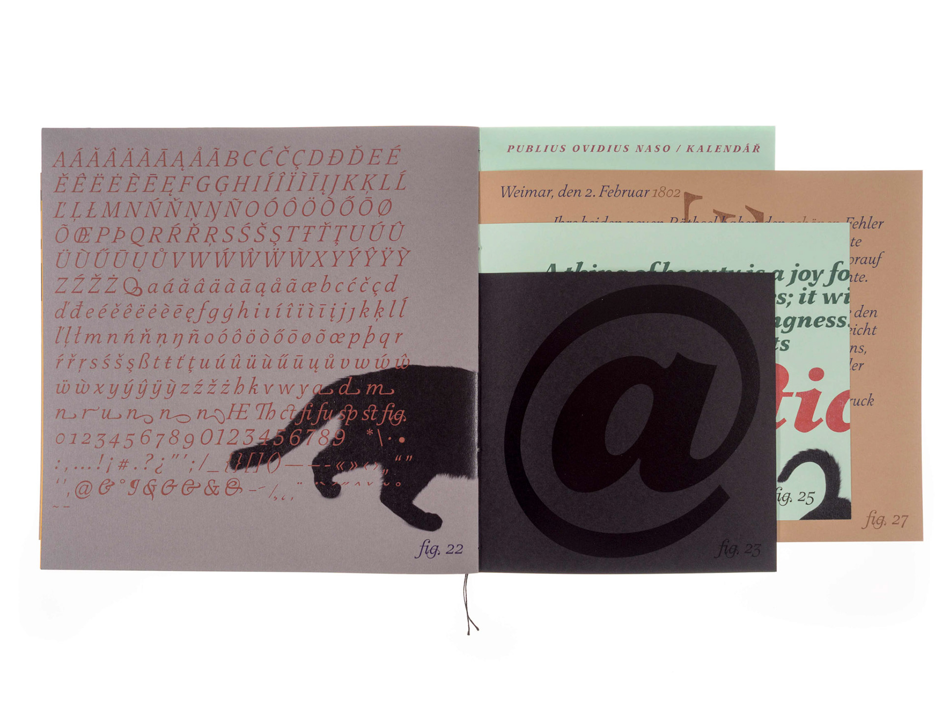
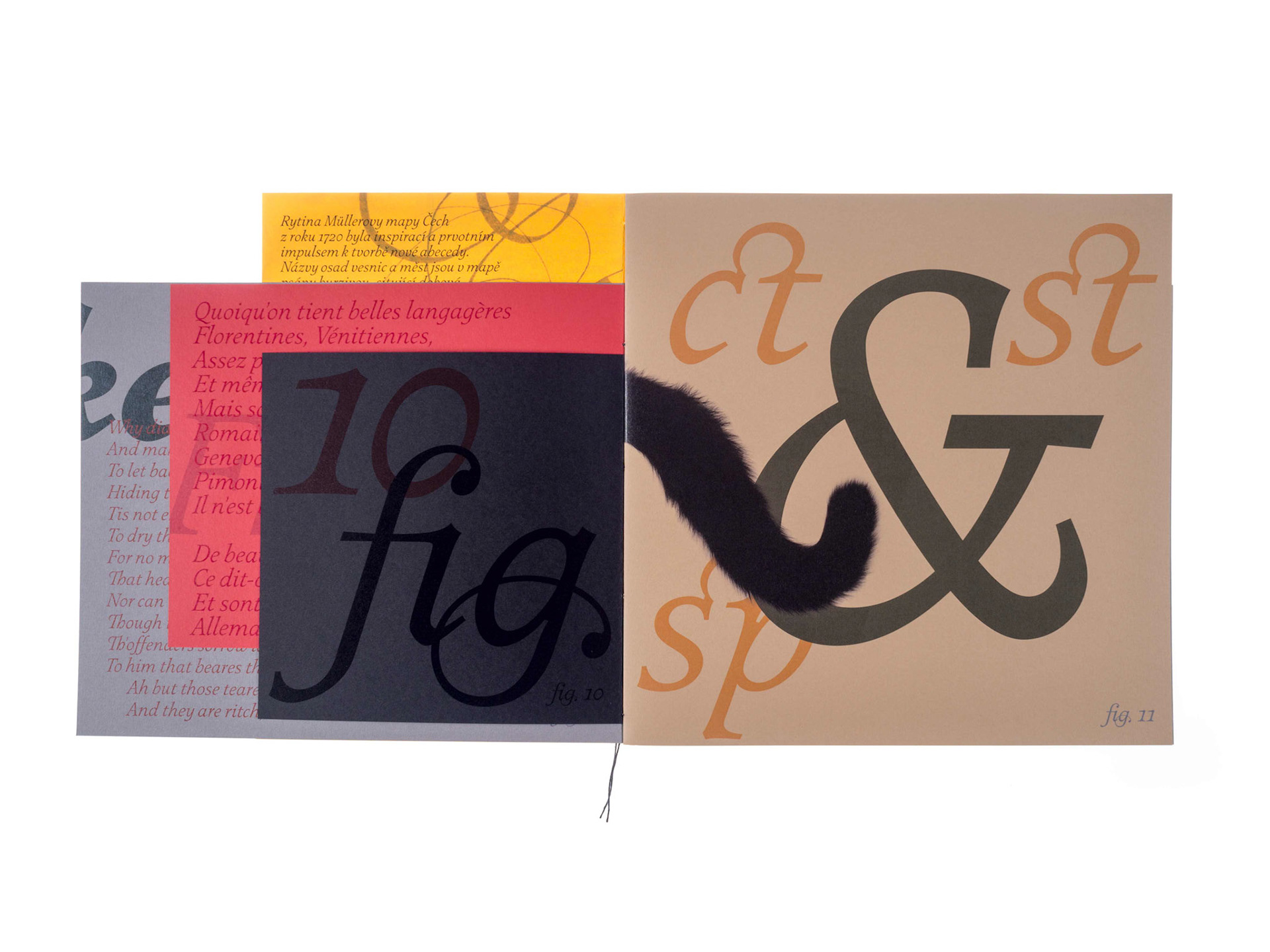
This new typeface isn’t just a reconstruction of those letters but it is a loose inspiration of work done by cartographer Johann Christopher Müller form Nuremberg and an excellent engraver Michael Kauffer. This new font is digitalized in two basic weights such as Book version and Black version. In between these two edge weights five other italics fonts will be interpolated. After the italics, the roman type will succeed in the same width so that it could originate in a vast set of this typeface with all necessary glyphs.
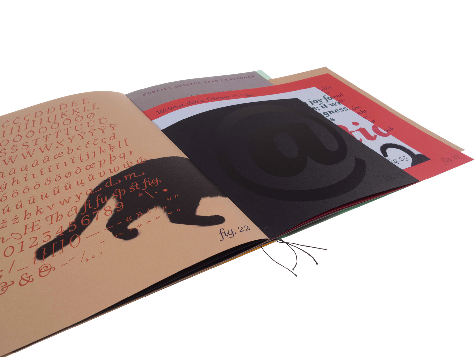
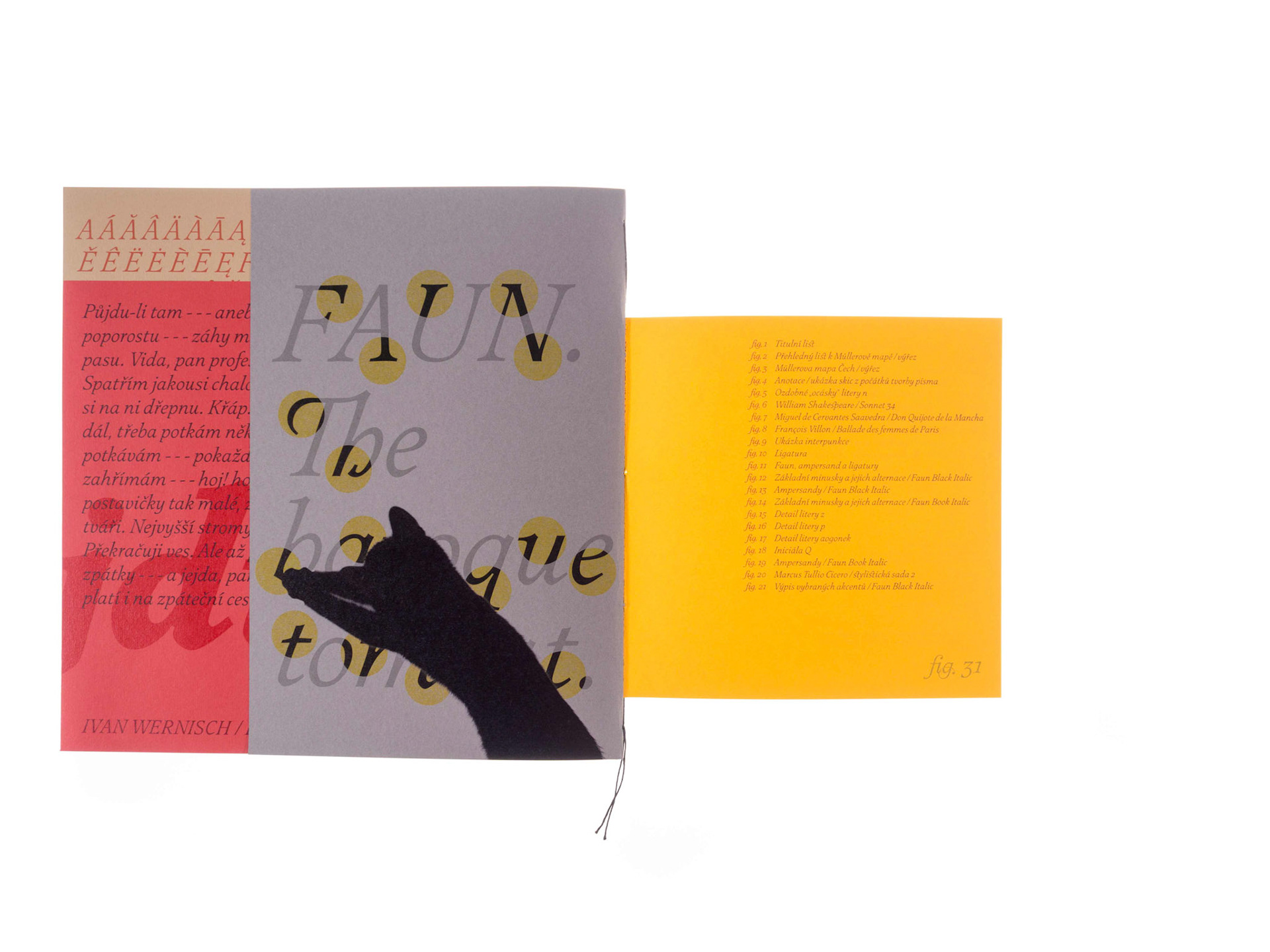
The name “Faun” was emotionally derived from a live kitten, which was an active eyewitness of author’s ample work. The liveliness of this companion reflects in calligraphic versions of many letters.
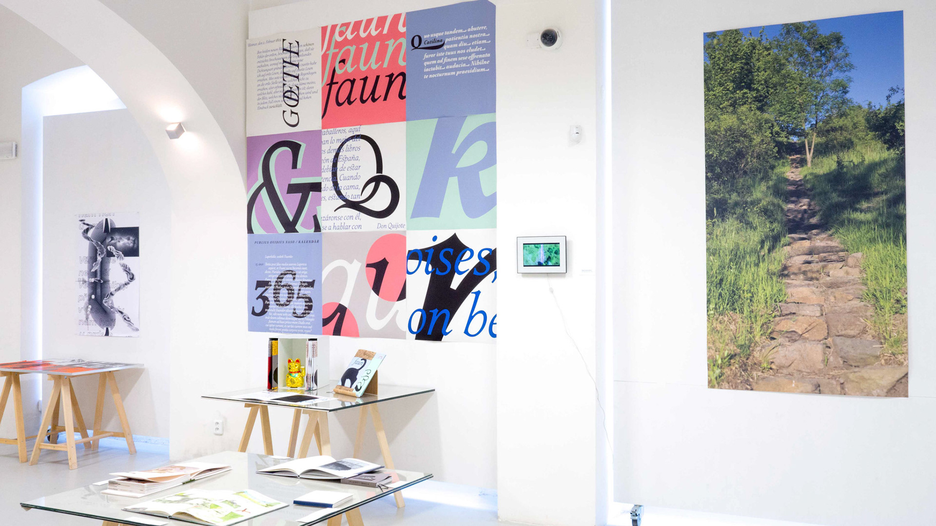
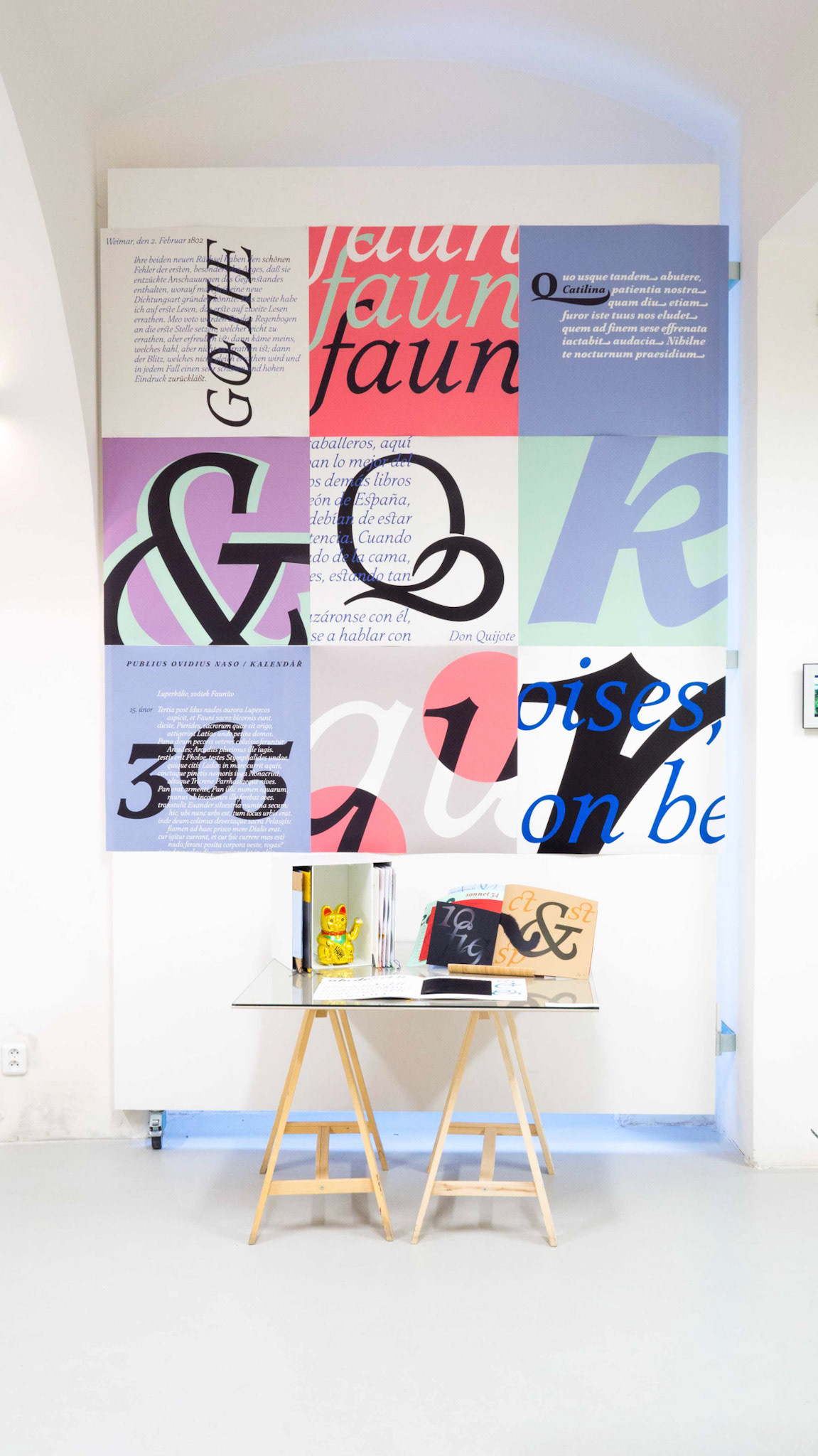
Faun was a part at an exhibition of the best Master and Bachelor thesises at The Ladislav Sutnar Gallery in Pilsen.
Thank you